- Afhalen na 1 uur in een winkel met voorraad
- Gratis thuislevering in België vanaf € 30
- Ruim aanbod met 7 miljoen producten
- Afhalen na 1 uur in een winkel met voorraad
- Gratis thuislevering in België vanaf € 30
- Ruim aanbod met 7 miljoen producten
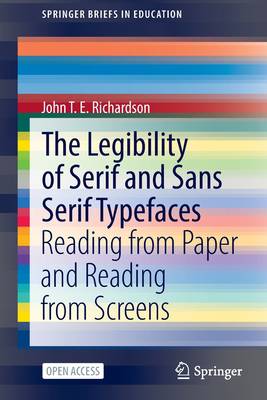
The Legibility of Serif and Sans Serif Typefaces
Reading from Paper and Reading from Screens
John T E RichardsonOmschrijving
This open access book provides a detailed and up-to-date account of the relevant literature on the legibility of different kinds of typefaces, which goes back over 140 years in the case of reading from paper and more than 50 years in the case of reading from screens. It describes the origins of serif and sans serif styles in ancient inscriptions, their adoption in modern printing techniques, and their legibility in different situations and in different populations of readers. It also examines recent research on the legibility of serif and sans serif typefaces when used with internet browsers, smartphones and other hand-held devices. The book investigates the difference in the legibility of serif typefaces and sans serif typefaces when they are used to produce printed material or when they are used to present material on computer monitors or other screens and it explores the differences in readers' preferences among typefaces.
The book's main focus is on the psychology of reading, but there are clear implications for education and publishing. Indeed, the book can be read with benefit by anyone concerned with communicating with others through written text, whether it is printed on paper or displayed on computer screens.
Specificaties
Betrokkenen
- Auteur(s):
- Uitgeverij:
Inhoud
- Aantal bladzijden:
- 161
- Taal:
- Engels
- Reeks:
Eigenschappen
- Productcode (EAN):
- 9783030909833
- Verschijningsdatum:
- 16/02/2022
- Uitvoering:
- Paperback
- Formaat:
- Trade paperback (VS)
- Afmetingen:
- 156 mm x 234 mm
- Gewicht:
- 254 g

Alleen bij Standaard Boekhandel
Beoordelingen
We publiceren alleen reviews die voldoen aan de voorwaarden voor reviews. Bekijk onze voorwaarden voor reviews.


