- Afhalen na 1 uur in een winkel met voorraad
- Gratis thuislevering in België vanaf € 30
- Ruim aanbod met 7 miljoen producten
- Afhalen na 1 uur in een winkel met voorraad
- Gratis thuislevering in België vanaf € 30
- Ruim aanbod met 7 miljoen producten
Omschrijving
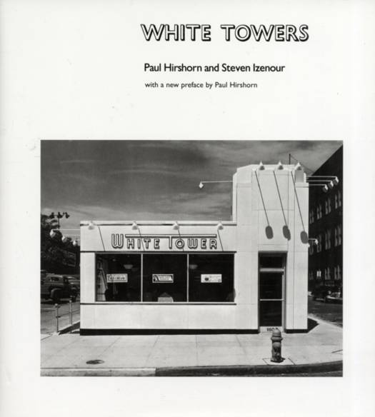
The reissue of a classic MIT Press title first published almost thirty years ago tracing the theme and variations in the architecture of the White Tower hamburger chain and recapturing a nearly forgotten piece of American history.
Today's dominant fast-food franchises spend millions to persuade us that they do it all for us, that we can have it our way. White Tower, the pioneering hamburger chain founded in 1926, never felt the need for this kind of advertising; it depended on its instantly recognizable building to say it all. Those gleaming white ("clean"), well-lighted ("always open"), streamlined ("fast and efficient"), human-scaled ("friendly") structures were three-dimensional billboards for their franchise, capped by an actual white tower often redundantly labeled, in bold graphics, "White Tower." This was branding before the age of branding. The photographs in this classic book not only trace the evolution of a restaurant chain, they record an iconography of a part of the American built environment that no longer exists. In an approach very much in the spirit of Learning from Las Vegas, by Venturi, Scott Brown, and Izenour, architects Paul Hirshorn and Steven Izenour have selected photographs taken in a variety of styles--from the stark and deadpan to family album-like snapshots. In an affectionately written introductory essay, Hirshorn and Izenour describe the identifiable and idiosyncratic commercial architectural style of the 1930s and 1940s and document the development of the White Tower buildings and their stylistic variations. Their conversations with former White Tower employees--including Charles Johnson, White Tower's architect for over forty years--are the source of many telling quotations and entertaining captions that set their analysis of the buildings within a broader story of corporate culture, mass marketing, and the rise of franchising in the twentieth century.
Specificaties
Betrokkenen
- Auteur(s):
- Uitgeverij:
Inhoud
- Aantal bladzijden:
- 189
- Taal:
- Engels
- Reeks:
Eigenschappen
- Productcode (EAN):
- 9780262083683
- Verschijningsdatum:
- 1/11/2007
- Uitvoering:
- Hardcover
- Formaat:
- Genaaid
- Afmetingen:
- 219 mm x 235 mm
- Gewicht:
- 820 g

Alleen bij Standaard Boekhandel
Beoordelingen
We publiceren alleen reviews die voldoen aan de voorwaarden voor reviews. Bekijk onze voorwaarden voor reviews.


