- Afhalen na 1 uur in een winkel met voorraad
- Gratis thuislevering in België vanaf € 30
- Ruim aanbod met 7 miljoen producten
- Afhalen na 1 uur in een winkel met voorraad
- Gratis thuislevering in België vanaf € 30
- Ruim aanbod met 7 miljoen producten
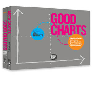
The Harvard Business Review Good Charts Collection
Tips, Tools, and Exercises for Creating Powerful Data Visualizations
Scott BerinatoOmschrijving
A good visualization can communicate the nature and potential impact of ideas more powerfully than any other form of communication.
For a long time, "dataviz" was left to specialists--data scientists and professional designers. No longer. A new generation of tools and massive amounts of available data make it easy for anyone to create visualizations that communicate ideas far more effectively than generic spreadsheet charts ever could. The Harvard Business Review Good Charts Collection brings together two popular books to help you become more sophisticated in understanding and using dataviz to communicate your ideas and advance your career.
In Good Charts, dataviz maven and Harvard Business Review editor Scott Berinato provides an essential guide to how visualization works and how to use this new language to impress and persuade. He lays out a system for thinking visually and building better charts through a process of talking, sketching, and prototyping.
In Good Charts Workbook, Berinato extends the usefulness of Good Charts by putting theory into practice. He leads readers step-by-step through several example datasets and basic charts, providing space to practice the Good Charts talk-sketch-prototype process for improving those charts. Examples include a "Discussion Key" showing how to approach the challenge and why. Each challenge focuses on a different, common visualization problem such as simplification, storytelling, creating conceptual charts, and many others.
The Harvard Business Review Good Charts Collection is your go-to resource for turning plain, uninspiring charts that merely present information into smart, effective visualizations that powerfully convey ideas.
Specificaties
Betrokkenen
- Auteur(s):
- Uitgeverij:
Inhoud
- Aantal bladzijden:
- 488
- Taal:
- Engels
Eigenschappen
- Productcode (EAN):
- 9781633697294
- Verschijningsdatum:
- 19/02/2019
- Uitvoering:
- Boek
- Afmetingen:
- 246 mm x 188 mm
- Gewicht:
- 1542 g

Alleen bij Standaard Boekhandel
Beoordelingen
We publiceren alleen reviews die voldoen aan de voorwaarden voor reviews. Bekijk onze voorwaarden voor reviews.


