- Afhalen na 1 uur in een winkel met voorraad
- Gratis thuislevering in België vanaf € 30
- Ruim aanbod met 7 miljoen producten
- Afhalen na 1 uur in een winkel met voorraad
- Gratis thuislevering in België vanaf € 30
- Ruim aanbod met 7 miljoen producten
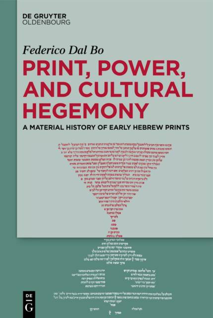
Print, Power, and Cultural Hegemony
A Material History of Early Hebrew Prints
Federico Dal BoOmschrijving
Federico Dal Bo examines the design of early Hebrew books from the late fifteenth and sixteenth centuries, focusing not only on the words in these early books but also on how they were arranged on the page. He follows in the tradition of scholars such as Christopher de Hamel, Marvin J. Heller, and David Stern, who have explored the importance of these Hebrew books in influencing Jewish learning and attracting the interest of Christians.
The author discusses important prints, such as the first Talmud and rabbinical bibles, which marked a shift from being for Jewish readers only to being for both Jews and Christians. The collaboration between Jewish editors and Christian printers changed the way these books looked and the audience for whom they were intended. At first, these early prints copied the style of handwritten Hebrew manuscripts. The simple layout could be difficult to read, especially for long books like the Bible or Talmud. But over time, influenced by the humanism of the Italian Renaissance, the layout became more complex. The book also looks at how the layout changed from full-page commentaries to a more complicated design in which the main text and commentaries shared the same page. This shift challenged the idea of who was the primary author and emphasized the role of editors. The layout, with the main text in the center and the commentaries on the sides, created a kind of unwritten rule for how to read religious texts. Dal Bo's study also includes new information about a 1553 trial in which the Talmud was burned. Overall, it explores how the layout of these early Hebrew books shaped cultural power and influenced how people read.
Specificaties
Betrokkenen
- Auteur(s):
- Uitgeverij:
Inhoud
- Aantal bladzijden:
- 367
- Taal:
- Engels
Eigenschappen
- Productcode (EAN):
- 9783111392684
- Verschijningsdatum:
- 23/09/2024
- Uitvoering:
- Hardcover
- Formaat:
- Genaaid
- Afmetingen:
- 156 mm x 234 mm
- Gewicht:
- 743 g

Alleen bij Standaard Boekhandel
Beoordelingen
We publiceren alleen reviews die voldoen aan de voorwaarden voor reviews. Bekijk onze voorwaarden voor reviews.


